Logo design & Branding
For Ethical clothes brand of Rita Hraiz
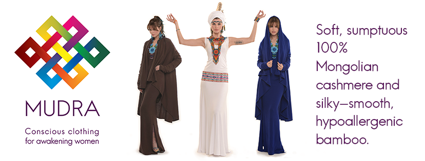
Rita Hraiz produces a line of luxurious cashmere garments for women which she sells both online and through her shop in Glastonbury. Her clothes are ethically sourced and come in a distinctive range of vibrant colours. Rita is a woman of many talents. Alongside her clothes line Rita also runs international Dharmakaya retreats and is a visionary artist of growing repute. Rita also planned to produce a new webinar series, which would also need some branding produced for it.
At the centre of all her various activities lies a deep sense of spirituality.
The Brief: Having developed her various businesses in a rather organic fashion over the years, Rita felt it was now time to readdress her branding and consolidate her various businesses under one unified look and feel. She had also come to desire a more professional branding, reflective of the price point and quality of her products.
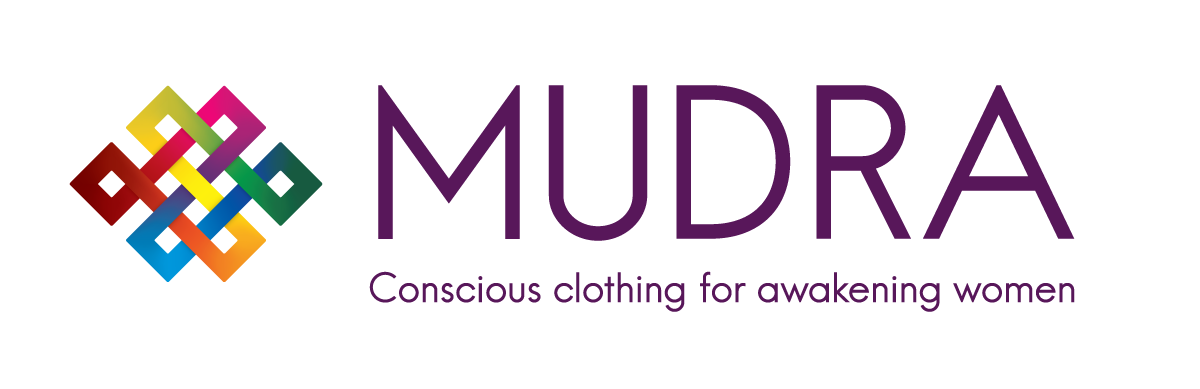
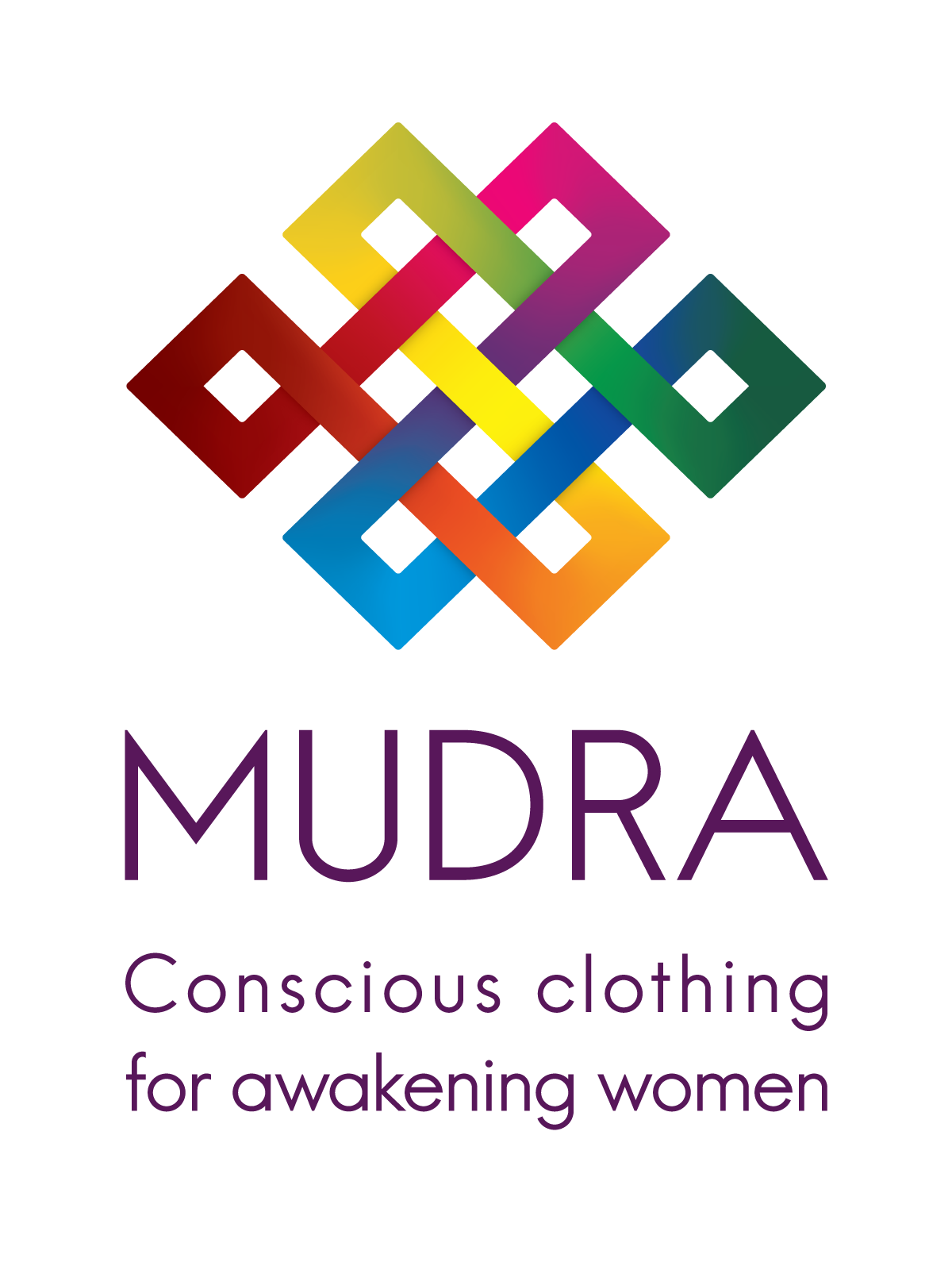
MUDRA - Conscious Clothing for Awakening Women
Rita's main business is her clothes line, the previous logo for which you can see below. From the current design she wished to keep the endless Knot element- an ancient Buddhist symbol, but wished to change both the brand name and strap line. The endless knot had previously appeared interchangeably in her branding, in both the perspective view seen below and in a traditional, undistorted top down view.
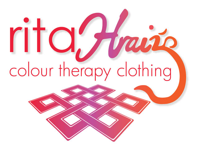
I knew straight away that the knot was going to be our common brandmark that would feature in all logos all of Rita's of a redevelopment of this symbol. In it's perspective view the Symbol lost some symmetry and with that some impact and strength i felt, so I opted to keeping with the undistorted, original design.
A distinctive feature of Rita's clothes line is colour. Her clothes are available in a full gamut of vibrant colours that traverse the spectrum of light, appearing as cashmere rainbow when viewed together on the clothes rail. Whilst reference to colour had been dropped in the new strap line, it remain fundamental to the brand and I wanted to reflect this in the new logo.
Having recreated the
While the spectral gradients of the endless knot symbol reflect the colours of her clothes line, the knot motif also serves a modular function, with each of Rita's side line ventures having their own logo each with a unique colour gradient taken from one part of the full spectrum of her flagship Mudra business.
Since the redesign Rita feels more confident in her brand and has been approached by a larger retailer in the United States who are interested in stocking her clothes line.
Facebook Assets
Facebook Page Coverflow design
CULTIVATING COUPLES WEBINAR SERIES
PROMO VIDEO PRODUCTION
FILMING AND EDITING
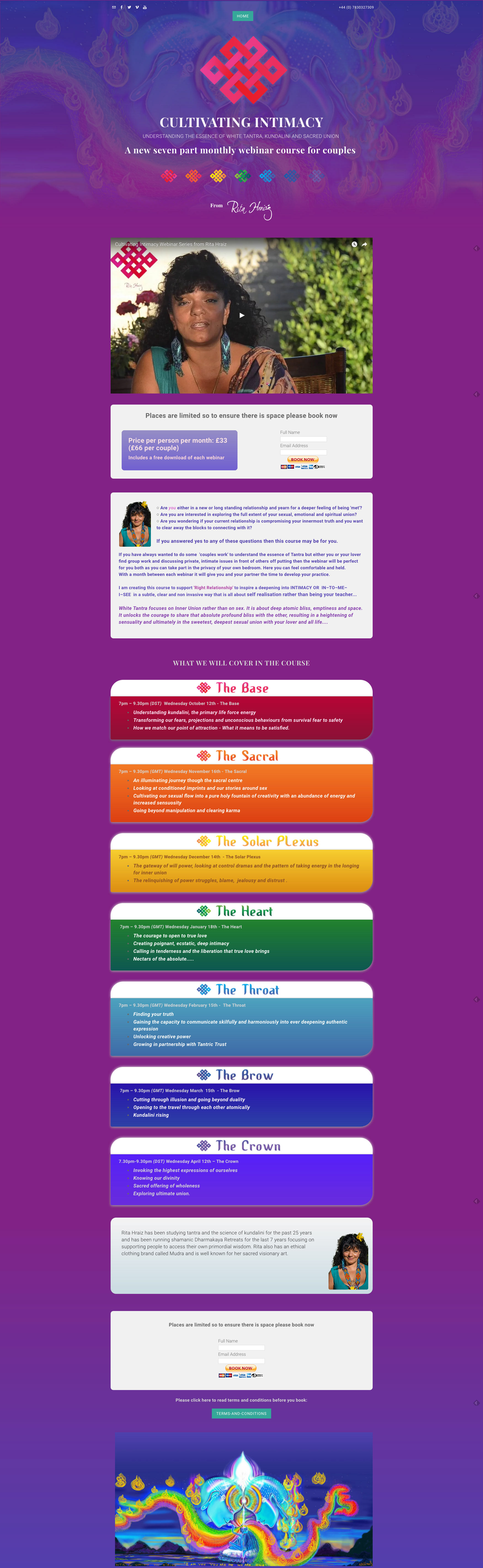
Webinar landing page
responsive page built in weebly
You can view the live page here: http://www.ritahraiz.com/webinars.html